When should a button be disalbed on a form on web page? Never. Except in the rare cases of uploading a file.
From a usability perspective, the pattern of using an <button disabled> in a <form> for form validation causes cognitive overload because users have to infer the form’s validation requirements.
An appropriate use of <button disabled> is when an active <button> changes temporarily <button disabled> when some action is being processed (e.g., image uploads, payment verification) that should block the submission of the form.
Leverage the web browser’s built-in HTML5 form validation (e.g., <input required>). Clicking on an always-active <button type="submit"> in a <form> validates all fields with their constraints and the user will be displayed native error messages. (Caveat: the error strings can be customised but the styles cannot be.)
Tips
- Add text hints contextually near the fields that are
OptionalorRequired. If most fields are required — so as to not clutter the UI and desensitise with distractingRequiredtext everywhere — useOptionaltext when needed and have the user assume the lack of impliesRequired. - Override the rendering of the browser’s error messages when the user clicks on the
<button type="submit">Next</button>, and then display a custom error message (ideally, contextually inline or, if the error involves multiple fields, at the top of the form).
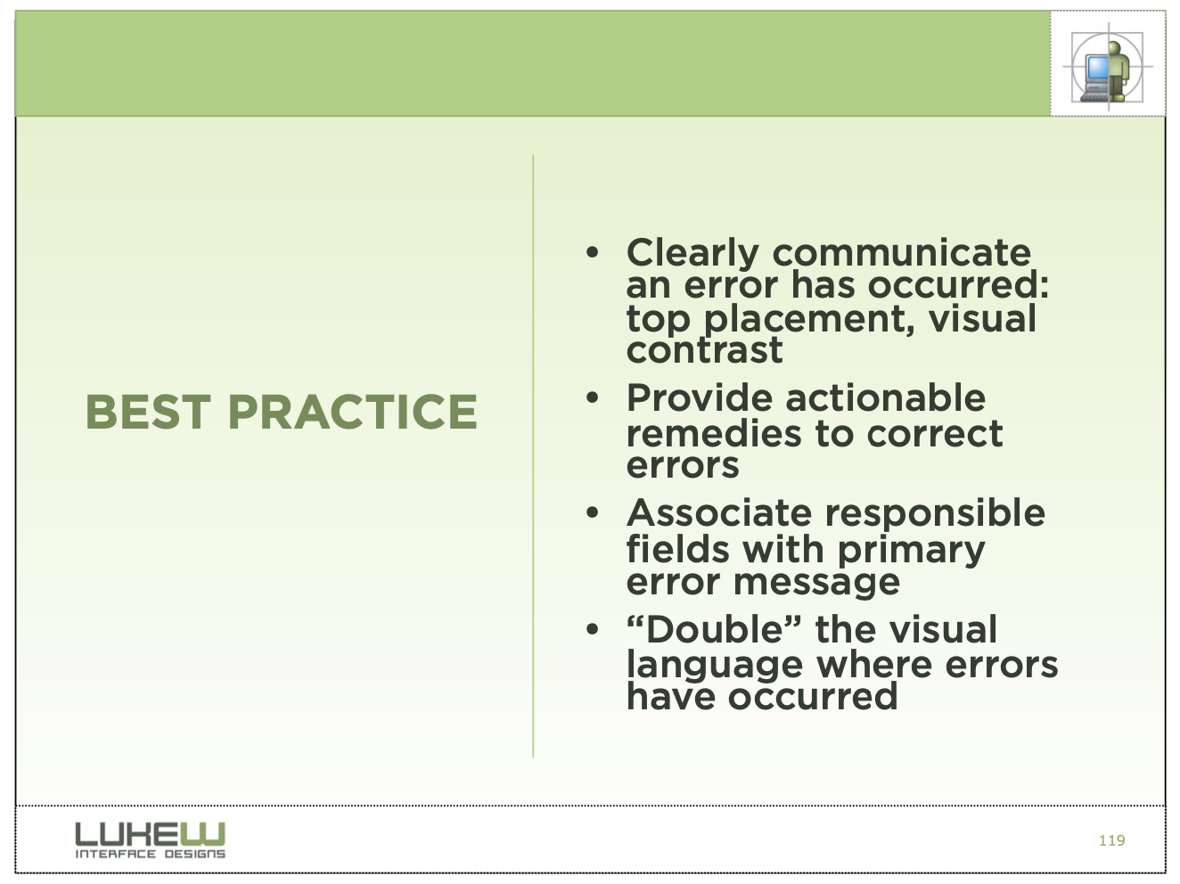
From usability expert LukeW’s book, (Best Practices for Form Design)(https://static.lukew.com/webforms_lukew.pdf):

Furthermore, there is somewhat of a consensus on UX StackExchange, which cites a relevant usability study:
Don’t ever disable the submit button and only show validation errors after the user hits submit.
And, another other one:
The always-active button [is the better solution].
Why?
With an always-active button, you can select it, and then be told what isn’t complete.
And, another other one:
With an inactive button, you are stuck. You may not know why it’s inactive and as such, hit a dead end.
And, another other one:
Inactive buttons are incredibly annoying. There’s no indication as to why they are inactive providing no way for the user to figure out how to activate
And, another other one:
If the form is still invalid when clicking submit you could auto scroll to show them (if they’ve get “out of the screen”) and show the errors below the fields until each field is modified. This approach is currently used by Google, Facebook and Twitter.
In case you want to disable the submit button, you MUST at least show a message next to it giving the reason why it’s disabled because if you don’t it could cause confusion to the users. Anyway I don’t recommend it, remember in that case you are supposing the user is thinking (and thinking correctly) “one step ahead”, which is a really bad UX design practice.
Reenable, not disable, your form-submission buttons. Your users will thank you.